Avatars
Avatars are used for display pictures, images in cards, email signatures, etc.
You can use avatar of 4 different sizes. Use class
avatar
and
avatar_circle
with the
<img>
or circular avatars. For size, use
avatar_xs
,
avatar_sm
,
avatar_md
and
avatar_lg
.

You can use avatars for texts too. Use classes
avatar_text
in addition to the previous classes. Use
<div>
here.
Alerts
Alerts are used to when we need to get user's attention immediately.
You can use several types of alerts you can use. Use class
alert_primary
,
alert_secondary
, and
alert_success
etc., as given in the code snippets below to use the colors of
respective kind.
You can use alerts with a closing button too.
Javascript
Badges
Badges are used to show the active/inactive, online/offline status of users by using dots of some specific colors on their images.
You can these with the avatars. Use class
badge_green
and
badge_red
to change the color of dots.
Badges on Avatars
Badges on icons
Icons on the badges come with 2 sizes viz. small and medium. You
don't need to do something for small icons, but to use medium ones,
you need to use
md
class as shown in the code.
Cards
Cards in chroma come in different sizes and orientation.
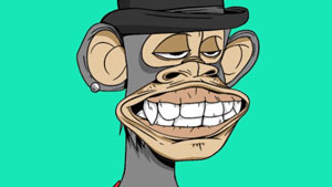
Bored Ape
by Vee
Rs.5000
Rs.6000
Bored Ape
by Vee
Rs.5000
Rs.6000
card_overlay
on the card and a container with a class
overlay_div
inside the card.
Bored Ape
by Vee
Rs.5000
Rs.6000
Card heading
Here you can put the subheadings that you want. Lorem ipsum dolor sit amet, consectetur adipiscing elit. Mauris venenatis, sapien lacinia tincidunt commodo, felis leo vehicula metus, et placerat mi velit et lacus

Bored Ape
by Vee
Responsive images
Responsive images in chroma come under 2 categories: normal responsive images and round reponsive images.
img_responsive
to make the image reposive.
img_round
for the image to be round.
Forms
Forms are used to take user data. Forms in chroma come under 2 categories viz. simple forms and forms with validation.
field_required
if you want the field to be mandatory, with
required
attribute in the input tag.
form_valid
class and id to check the validity of your forms.
Typography
You can use classes
h1
,
h2
,
h3
,
h4
,
h5
,
h6
to use Chroma's font sizes.
Heading 1
Heading 2
Heading 3
Heading 4
Heading 5
Heading 6
<p>
tags. Use classes
txt_rg
,
txt_lg
,
txt_md
, and
txt_sm
for text of regular, large, medium and small sizes.
This is a large text.
This is a medium text.
This is a regular text.
This is a small text.
txt_light
for lighest and
txt_boldest
for boldest text of Chroma.
This is the boldest text.
This is a bold text.
This is a semi-bold text.
This is a regular text.
This is a light text.
gray_primary
, for headings and
gray_secondary
, for the content. You can also use
txt_right
and
txt_center
to adjust the alignment of text accordingly. Use
txt_strike__through
for using strike through text.
Primary gray text.
Seconday gray text.
A strike through center text.
A right aligned text.